
Giving statistics is the best way to gather momentum at the start of any post. As Hosting Tribunal reports for 2022, of the two trillion of existing sites 400 million are in operation today. These include both old timers, which were around when the Internet saw the bloom of JavaScript, and recently developed SPAs. It seems, the possibility to see what sites looked like 5, 10, 20 years ago using the Wayback Machine service is underestimated. This a real treasure-trove of web design trends of various years, which can be seen from eBay snapshots from 1999 to this day. However, Wayback Machine basically proves that websites existed in the past, are out there today, and are not going to disappear.
Though there were at least two attempts to kill them, there were those who stood up for them.
First attempt: social media
In 2011, adviser and writer Mikal E Belikove wrote a small note for the Entrepreneur titled Five Reasons Why Websites Still Matter. 11 year ago Facebook* questioned whether we really needed websites so much. The social medium with the audience embracing 800 million of users at that time was rapidly gathering pace creating attraction both as a new channel of communication with kinsfolk and friends and as a business card, reception desk, portfolio, and promo-platform for businesses worldwide. The author of this post seeks to prove that a Facebook page is not equivalent to a website arguing that:
- Facebook has the same design for everyone, which is why it follows neither your taste, nor your business objectives — in contrast to your own website;
- You are not able to influence the features of your account, its speed, hosting, and other technical aspects — while you can influence them if you have your own site;
- Facebook lacks flexibility in terms of content delivery, CTAs formats, and their placement — while your own website is flexible enough;
- SEO settings for the Facebook page and, consequently, clients who find your through search engines are out of the question — which is not the case with your own website;
- Facebook cannot give you enough useful data for analysis. Compared with what? You know the answer already.
It would be strange to tell that the eccentric Harvard undergraduate created a dummy but shifting the responsibility for your business income to him would be an even greater mistake — you don’t call the rental apartment your own, do you? Facebook and other social media are channels of communication with your audience that have their own lead generation tools and creative potential. However, they have their limits and issues, especially today, when moral and ethical standards are going through specific growth points — you never know whose feelings you may hurt on your page tomorrow.
*The company’s activities are prohibited on the territory of the Russian Federation
Second attempt: mobile apps
Several years passed and everyone started talking about the mass transition from desktop computers to smartphones and tablets. Mobile traffic was increasing, as was the number of downloaded applications and revenue from purchases made through smartphones. Some inexplicably interpreted this as another sign of the web and sites phase-out but in 2014 Nathan Matuska’s column on the Wired announced: this was not the web dying, this was the way of working in the web that was changing. PCs are losing status quo under the pressure of smart and fast pocket devices, so let’s make it easier for them to work on the web, too. Take note of the applications ability to display content and generally work offline, but they got this content only in the moment of stable Internet connection, that’s for sure.
Conclusion: just like social media, the mobile application is the continuation of your website, not its full-fledged substitute.
How to bring together websites and mobile Internet
The world of web is rich in development tools for websites which are comfortable in the mobile Internet. Do you wish not to spend much effort on the mobile version of the website? Use Bootstrap. Smooth interface operation? The React library and isomorphic applications are at your disposal. Do you want not to multiply backends but to manage content for all devices and platforms with any interface through a single system? Use the headless CMS architecture.
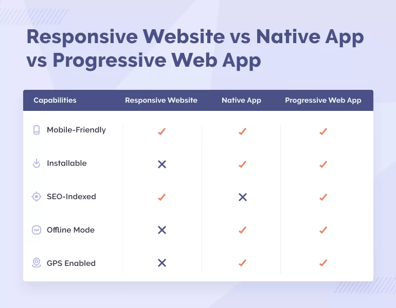
Well, OK. Or do you want your website to behave almost like a mobile application on a smartphone? Over the last several years the former and the latter came so close to each other that they became almost indistinguishable, which is demonstrated by the progressive web applications technology (PWA). You can work with Tinder, Pinterest, Spotify, Telegram, The Washington Post, and other products in a mobile browser and have the experience similar to the experience of a native application user: open apps by tapping on the desktop icon, receive pushes, and even read posts and view images offline — just take any smartphone with a popular browser and see for yourself. When working on PWA programmers use standard cross-browser and web technologies and create a single code base shared on all platforms, which cuts the costs significantly. While promotion of a mobile application is a separate approach with its own tricks named App Store Optimization (ASO), PWA is indexed by search engines similarly to an ordinary website.
How to re-energize a website
We would not like you to take this reasoning as the way to protect our professional interests. Yes, we do develop websites but at the same time we use mobile applications: every day we use them to call a taxi, order food, go to social media.
But to be fair, the cited posts about website competition with social media and applications were read from the web browser, while the text you are reading was written in the browser version of Google Docs. This turned out to be so convenient both 10 year ago and today that we want to continue working in this way. And Google Docs is not the only service comfortable to work with on a desktop computer. This is why before finding a team of mobile developers think how you can improve the site you already have.
We’ll help you with this.
The problems you may face on the website
Below we are listing potential problems you may even not be aware of. They are waiting for you in the interface design, as well as in the software, in content, and in cyber security. Judging from experience, some website owners don’t know that the mobile version and CTA in visible places are useful things, this is why we’ve tried to draw together both the evident issues and those that not everyone may guess.
We’ve prepared a “secret level” waiting for the most diligent site owners: PDF with links to useful tools for the issues listed above. Eliminate at least one issue and you can expect the conversion increase and bounce rate reduction; ignore them all and say goodbye to your online audience.
Website performance and search engine optimization
Core Web Vitals
Time is the critical resource for everyone: for you, for the users, and, of course, for search engines. Since 2020, Google’s top search results include best performing websites based on the metrics listed in the Core Web Vitals:
- Largest ContentFul Paint (LCP). Range: 2.5–4 seconds;
- First Input Delay (FID) is the delay between the user’s first action and the browser’s response. Range: less than 100 ms but no more than 300 ms.;
- Cumulative Layout Shift (CLS). Shows the assessment of the page visual stability. Pop-up banners and windows can make some parts of the page move, disorienting the users and reducing CLS. Range: less than 0.1 but no more than 0.25.
Measure these parameters — even if ¾ of the pages fail to meet the lower limit, Google will cut the site rating.
Video and images
- Demonstrating graphic content to the user requires a lot of hardware resources. Before uploading the content, optimize all jpg and png files using such tools as TinyPNG or use the latest WebP, JPEG XR, or JPEG 2000 formats;
- Another way to save resources on graphic content is to upload photos and videos on as-needed basis, i.e. as soon as they become visible to the user. This task is solved by the lazy loading design pattern;
- Mobile Internet is not always fast. Using the same image for the mobile and desktop site versions reduces the download speed. Many CMSs include the image resizing function. Be sure to learn whether your CMS is in this list.
JavaScript
- JavaScript performs several tasks: enables the work of interactive functions, gathers statistics on user actions, uploads new content. SEO specialists have to facilitate the content scanning process and reduce the number of issues that occur when pages using JavaScript are processed. This can be achieved using the Server Side Rendering approach, dynamic rendering, JS frameworks, and such libraries as React, Vue, and Angular;
- Make sure that search robots can scan JS files affecting the page display. For example, you can modify the robots.txt document by adding the respective directive for Googlebot robot;
- If you use infinite scroll on your site pages (AJAX or JavaScript pagination), we recommend that you should not upload new items in the shop or posts in the blog automatically but implement this feature using the “Show more” button. Additionally, set up page numbering through <a href=""> links.
Code issues
Not only images suffer from overweight. JavaScript, CSS, and HTML files also need optimization. Developers know a lot of paid and free tools used offline and online which are and are not focused on optimization aspects. You’ve never given thought to this, haven’t you? In this case even the Google PageSpeed Insights will tell you a lot of new things.
Some inspiring statistics:
- In SEO, ROI can be 12 times higher than the marketing costs (Terakeet);
- If compared with Internet advertising, quality search engine optimization can cut the cost of attracting users almost by 87.5% on average (Terakeet);
- Good SEO increases the blog’s business value by 429% (Terakeet).
Design
Images
Clothes do not make a man but first impressions are half the battle. The same applies to site images: hire a photographer or artist who can convey the idea and best properties of your business and the products and services you offer.
CTA
CTA elements (buttons, order forms, etc.) are an important link between visiting your site and buying a product or service. Make sure that the elements are visible and contrast with the rest of the website’s content. Don’t overdo it — the main page should have no more than three or four CTAs. And start provoking site visitors immediately at the time they come to the site and see the first screen.
Navigation
If site users have to wander about the site in search of the desired action, they will soon lose enthusiasm and find the most radical way out just closing the tab and never opening it again. To avoid this, find an UX designer and describe your business in detail. The designer will create a prototype, check it in the test group, get feedback, make corrections, and eventually the users will find the things they look for in a couple of clicks.
Some inspiring statistics:
- Surprisingly, 70% of startups and small businesses do not place CTA on the main page (Business2Community);
- 48% of users estimate the business’ trustworthiness judging from the website design (Virtual Window);
- 38% of users close the tab if the page is based on an ill-designed layout (WebFX);
- Users spend 88% more time browsing on websites that have videos (Social Media Week);
- On average, users look at the main image for about 6 seconds (CXL);
- Poor navigation makes 37% of users leave the website (Komarketing);
- 89% of users switch to a competitor’s site after a poor user experience (WebFX).
Mobile version of a website
We all know for ourselves how much time we spend with the mobile phone — and if not, weekly report on the screen time will give details. There is no need to explain the importance of the site’s mobile version, that’s why we give only one piece of advice here: if you don’t have a mobile version yet, create it immediately.
Some inspiring statistics:
- Since 2017, more than 50% of the global organic traffic has been stably mobile traffic (Statista);
- 74% of users return more willingly to websites with a high-quality mobile version (Google);
- 85% of users believe that the mobile version should not be inferior to the desktop version (Visual.ly);
- The Conversion Rate metric is 64% higher for mobile devices as compared with desktops (Formstack).
Read more on website dimensions and make sure your site renders well on all devices.
Content
Quality
- Don’t hesitate to use Grammarly, take the advice of Google Docs and read texts several times before publishing them;
- Squeeze out water and strive for the sense and logic of the text. Seemingly serious companies sometimes write posts that make you wish you hadn’t spent time watching memes instead of reading them;
- Don’t try inserting key words and phrases where this is not justified as the result may be absurdly funny but not effective;
- Maintain the text structure using headings and subheadings and phrase them in such a way that it would be sufficient for a user to read them to understand whether this blog post will be of use.
Arrangement
Jakob Nielsen’s study has shown that users read web pages in an F-shaped pattern. This discovery was made 16 years ago and is still relevant. However, users have also formed other patterns and models to work with the content: Z-pattern, T-pattern, “zig-zag”, “golden triangle”, Gutenberg Diagram. These are not just observations, but researches conducted with the use of eyetracking technologies. The resulting conclusion is that you’d better not try teaching people to read in a different way unless you are striving for a high bounce rate.
Mobile devices optimization
Imagine that a user started reading your post on the desktop site version but decided to continue reading on their phone while in the underground. Make sure that the text and images are not too small.
Contact info
The telephone number, address and e-mails of the company’s representatives are sometimes hidden in a nontrivial place or just missing. Of course, you can use Ctrl+F to search for e-mail address by the @ symbol, but this is for the most reckless and witty. It’s unlikely that the majority of users will be ready to use these qualities at once, so use the header and the footer effectively or even create a separate page with the contact info.
Some inspiring statistics:
- 86% of users want to learn about the company and its products and services on the homepage (Komarketing);
- 46% of the users who look at the website and cannot gather what the company is doing will leave the page (Komarketing);
- The majority of users start examining the website from the left upper corner (CXL);
- Website’s visitors spend 80% of time in the left part of the screen (Nielsen Norman Group);
- When working with the content in mobile versions, users focus 86% of their attention on the upper part of the page (GRCAI).
Cyber security
DDOS attacks
Unfair competitors or just reckless hackers can limit the access to your website significantly by using a network of infected computers to simulate the number of requests the server is not able to process. That’s the DDoS meaning. To avoid this, the website architecture should be designed for high loads.
Brute force
Bruteforce is an attempt to hack your site or its parts through mechanical search for the correct “login–password” combination. The analysis of authentication errors and blocking of suspicious users by their IP numbers helps repelling the bruteforce.
IDOR (Insecure Direct Object Reference)
This is a separate type of bruteforce targeting the URL addresses of pages, files, and directories, as well as specific user profiles and correspondence. When inventing passwords be free to use letters in different registers, figures, and symbols and set limits for sign-on attempts by time or by IP addresses.
XSS (Cross Site Scripting)
XSS is gaining access by embedding malicious scripts through the dynamic site elements (e.g. messaging fields on forums). XSS attack can be prevented by filtration of HTML symbols or their replacement with equivalents so that the field would not treat the entered text as executable code.
SQL-injection
SQL injection is changing GET requests, POST requests, and cookies to access an SQL database. Close attention to requests and symbol filtration will help to prevent the attack.
Some threatening statistics:
- In 2020, companies collectively paid $350M to cyber criminals (Chainalysis);
- Over 2021, the number of cyber attacks grew by 40% (Check Point);
- Per 61 companies there is one attacked by hackers on a weekly basis (Check Point).
Conclusion
There are lots of stories telling you that it’s enough to make an order button a little bigger and move it a little bit sideways to increase sales. Technologies are evolving, users change their habits and behavior, the world in general changes, as well as the ways to live in this world — these are the changes your website has to follow. Keep track of trends, check the analytics, and make conclusions about the website issues and development. We hope our post will help you with this.