No time to read it now?
We will send a link to the article to your inbox
Categorizing CSS
Each project requires a certain organization. Each time adding a new CSS-rule to the end of one file, you make this file more difficult to read which confuses anyone else working on the project. Now we'll take a look at the CSS architecture proposed by Jonathan Snook.
A minimal base SMACSS has five categories:
- Base
- Layout
- Module
- State
- Theme
We often mix styles of these categories. If we know what we do, we can avoid the complexity arising from the intertwining of these rules.
Each category has specific instructions that must be followed. This separation allows us to read the code structure easily - what and how is stylized.
This structuring results reducing code and simpler maintenance. These are obvious advantages.
Base rules are default values. In addition to standard tags and selectors, their different states, pseudo-classes and more are styled. In this category, as a rule, all selectors are the first level selectors.
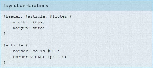
Layout rules specify the location of the sections (header, content, article, etc.) on the page.
Module rules. Main Category. There is a specific item description (search blocks, accordions, tabs, etc.), regardless of its position or condition.
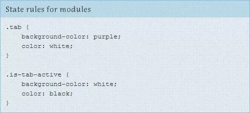
State rules are the way to describe how our modules look like in a particular state. Hidden or expanded, active or inactive.
Theme rules describe how Layouts and Modules look when changing the theme.
Base rules
The rules are applied to an element with a selector with no class or id, to child elements, pseudo-classes, and different states. This category contains general rules that do not require rewriting or reset. Do not use !Important.
This is a stylization of different headings, links, body, the overall style of the buttons, and more.
You should always specify a background color for body and color of links.
It also includes resetting rules.
CSS Resets
This is a set of rules created to reset default properties for different elements. His aims are to remove the differences between the display of these elements in different browsers and to create a base for further site stylization.
Adherence to this system will eventually make so that the developer acquires its own set of rules to reset default styles, and therefore he is no longer dependent on the standard of aggressive reset.css.
Layout rules
Page has global components. These are the upper part of the site (header), the lower part of the site (footer), sidebars, content, which in their turn can be divided into several more regions. In this category, only these global elements are styled.

The use of same classes in the main section helps to avoid duplication of code.
Module rules
The module is a discrete component of the page. There are navigation bars, carousels, dialog boxes, widgets, etc. This is the essence of the page. Modules are in the Layout. Modules may sometimes be inside other modules. Each module must be designed as a separate component. This page will be more flexible. Modules may easily be moved to different parts of the page without damage.
When defining a set of rules for modules avoid using id's, adhering only to the class names. The module will probably contain many elements - all of them are styled here, taking module's as a selector parent's class


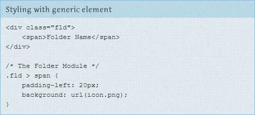
If possible, avoid classes and id, it is better to adhere to a child or common elements. This advice stems from the fact that the module can be further extended, by this we also reduce the number of lines of code and avoid duplication of similar items. On the other hand, referring to the child elements we will not extend the rules to other elements which help to prevent further conflicts in using classes.
When placing the module in a different layout element the rules are easily rewritten at the expense of a more specific treatment. For a more versatile styling it is recommended to use “%” as the basic unit of measurement, at least for the width - this will allow us to move our module from one layout to another with absolutely no loss.
State rules
A state is what increases and overrides all other styles. For example, the accordion can be in collapsed or expanded state. The message may be able to success or failure.
Conditions are commonly applied to the same element in the same way as module rules.
There are many similarities between module styles and styles of the state. They change the existing layout of the element. However, they differ in two key aspects:
- State styles can be applied to the placing of the module;
- State styles indicate the dependence of JavaScript.
This is the second point that is the most important difference. Module styles applied to the element during the loading of a site and then never change again. While the page is still running on the client machine, state styles are applied to the elements when they change their state.

Only this file allows the use of “!Important”. Two states of the module at the same time is impossible, so conflicts cannot arise.
Theme rules
The theme determines the rules that changes the style of the main theme. These styles are easily revised for alternative topics.

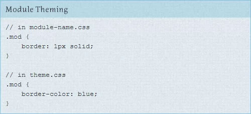
Themes may affect any of the main categories. Let's say you have a module that should have a blue border, the border itself would have been originally defined in the module, and then the theme overrides the color.


